
Improving information architecture of a community health service website
📍 Melbourne, Australia | ⏱️ 2 weeks
Challenge
I was engaged by Nomat to analyse a tree testing study as part of improving the information architecture (IA) of a community health service website.
Outcome
Improved information architecture (IA).
About Tree Testing
Using a software platform called Optimal Workshop, participants were given 12 tasks that asked them to locate some information.
For each task participants clicked through a link ‘tree’ and indicated where they expected to find the information.
More than one solution can exist for each task, and task order was randomized for each participant to account for increasing familiarity with the tree structure as tasks progress.
Research Design
Research Goal
Understand how effective the new structure is at supporting the findability of priority information relevant to users’ top tasks.
Investigate where participants look for information to inform further refinements to the IA structure.
Identify any issues or concerns with the key changes to the structures.
Methods
Task success analysis
First click and visit analysis
Treejack analysis
Key Insights
#1 Although the “What we do” section attracted traffic for the right tasks (community group, about cohealth and partnerships), it also attracted many unwanted clicks, presumably because the name is too general

Analysis

“What we do” attracted many incorrect first clicks and visits with tasks related to “Health services” and “About us”.
Recommendation

Remove “What we do” from the top-level sections, and move it to “About us”.
#2 Although “Get involved” and “Careers” were selected by many participants looking for jobs, top-level sections were confusing.

Analysis

Most participants didn’t get the first click right, they went to “Contact us”, followed by “About us” (right answer) and “Health services”. This indicates those labels are not distinct enough.
All top-level sections were clicked by many participants, presumably because they were confused about where to look.
“Get involved” was easily found which suggest the label is effective.
Recommendation

Relocate “Get involved” to the top level sections.
#3 “Mental health” and ”Healthcare” were not expected by many participants looking for counselling.

Analysis
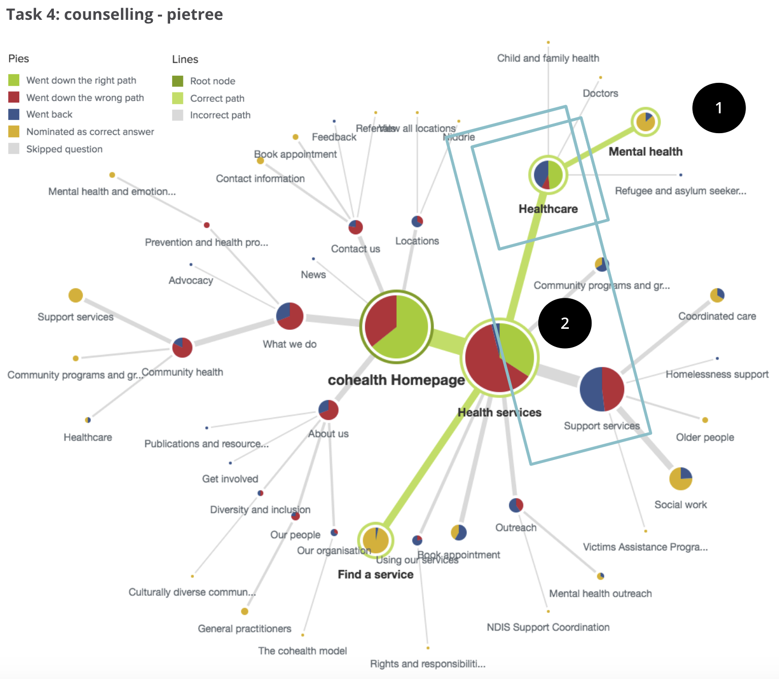
More than half of participants who went to “Healthcare” didn’t choose “Mental health” as the right answer.
“Healthcare” got fewer clicks than “Support services” by participants who went to “Health services”.
Recommendation

Relocate “Counselling” on its own and cross-link it to “Community health”.
#4 The top-level sections were confusing for many participants looking for diversity and inclusion information, with “Health services” commonly attracted unwanted traffic.

Analysis

Most participants didn’t get the first click right, they went to “Health services”, followed by “About us” (right answer) and “What we do”. This indicates those labels are not distinct enough.
3/6 top-level sections were clicked by most participants, presumably because they were confused about where to look.
Clicks are distributed in multiple sections which indicate participants expected the info would be found in “Health services” but subtopics were not distinguishable.
Recommendation

Cross-link “Diversity and inclusion” to “Health services” and to “Using our services”.
#5 Although “Using our services” worked well for participants looking for eligibility, “About us” and “What we do” were clicked by a fair number of participants.

Analysis

Most participants didn’t get the first click right, they went to “Health services”, followed by “About us” (right answer) and “What we do”. This indicates those labels are not distinct enough.
3/6 top-level sections were clicked by most participants, presumably because they were confused about where to look.
Clicks are distributed in multiple sections which indicate participants expected the info would be found in “Health services” but subtopics were not distinguishable.
Recommendation

Cross-link “Diversity and inclusion” to “Health services” and to “Using our services”.
#6 “Contact us” attracted unwanted clicks from participants looking for opening hours.

Analysis

“Contact us” attracted unwanted first clicks and visits from participants looking for opening hours. Presumably because:
They preferred to contact the organization as they might find it easier or more accurate.
Based on their previous experience using similar sites, they would usually find opening hours info within “Contact us”.
Recommendation

Cross-link “View all locations” to “Contact us”
#7 Although “Support services” worked well for participants looking for older people, it attracted unwanted clicks from other tasks (counselling, community programs and disability), presumably because the name is too ambiguous.

Analysis

“Support service” got unwanted clicks from participants looking for counselling.
“Support service” got unwanted clicks from participants looking for community programs.
“Support service” got unwanted clicks from participants looking for diversity and inclusion.
Recommendation
Consider renaming “Support services“ to make it more concrete and specific.
Impact
The insights have been delivered to cohealth and utilised as the basis of the information architecture improvement as a part of the website redesign.